Everything you need to know about product analytics dashboards
Uncover the potential of product analytics dashboards for PLG companies, boosting user onboarding, feature adoption, and reducing churn. See examples and learn about which tools are best for your company.


Authors of this article


Dave is a data guru and CEO of Dromo, a company that helps with data importing, normalization, and transformation. He's spent hundreds of hours setting up product analytics infrastructure.


Nick is the CEO of Signal, a product that creates data-powered territory plans for sales reps. He previously led a data engineering team at Okta before starting Signal.

Chase founded Flywheel after creating and launching Jira Work Management at Atlassian. He has executed product-led growth across multiple verticals and companies, ranging from SaaS to e-commerce.

What are product analytics dashboards and who uses them?
Product analytics dashboards are the data homepage for most employees. At best, they guide decision making at the highest levels. At worst, they’re cluttered, outdated, and misleading. Dashboards should give a deep view into various product-related metrics, making it easier for businesses to identify trends and patterns, understand the effectiveness of their strategies, and make data-driven decisions. A product analytics dashboard is one of the cornerstones for product managers, marketers, data analysts, and UX/UI designers who are responsible for driving product growth.
The primary purpose of an analytics dashboard is to highlight important product data in an organized and easy-to-understand manner. This data can include metrics such as user engagement, retention, conversion rates, and revenue.
Whether you're a startup launching a new app or an established company looking to grow an existing product, building an analytics dashboard can go beyond simply showing data and can help you guide your product to success.
Why are product analytics dashboards important for PLG companies?
In product-led growth, your product drives customer acquisition, expansion, and retention. However, products don’t give feedback on themselves and getting in touch with users is both hard and generally laggy. Product analytics fills in that gap. If you’re just starting to track data, check out our guide to product analytics before reading this article.
Unlike traditional product dashboards, those designed for PLG companies should show more than just numbers. For example, the default dashboard in Flywheel can be filtered by user personas and shows which marketing channels your users interact with the most.
Onboarding
PLG dashboards track user onboarding metrics such as the number of sign-ups, activations, and time-to-value. By monitoring these metrics, companies can find areas for improvement and user pathways that increase organic growth.
Adoption
Understanding which features resonate with users is necessary for both marketing and product teams at PLG companies. A good dashboard will reveal feature adoption rates, helping teams prioritize features and guide users towards high-value functionalities.
Segmentation
Advanced dashboards allow companies to perform cohort analyses, segmenting users based on various attributes like demographics, acquisition channels, and usage patterns. This granular data enables companies to tailor their marketing, sales, and product strategies to different user groups, driving higher engagement and retention.
Churn prediction
By identifying early warning signs of churn, PLG companies can proactively address potential issues and retain users. Dashboards reveal patterns in user behavior, allowing teams to pinpoint the factors that contribute to churn and take corrective action.
These four concepts will keep your company on top of every category of the user lifecycle. Of course, incorporating all of these metrics may make the dashboard too large. At Flywheel, we’ve curated metrics from each of these categories to include in our dashboard. For other companies, it may make sense to focus only on a specific category, such as Adoption. It’s up to you!
What are the fundamental features of product analytics dashboards?
Every product analytics dashboard is unique and should be customized to the organization. At their core, though, the best will have these features:
Real-time data: The biggest advantage of product analytics is that it can be calculated in real time. As product usage data is constantly changing, this helps teams make decisions based on the most recent and accurate data.
Data visualization: Numbers are useful, but a dashboard’s advantage is the ability to present complex data in visually appealing and easy-to-understand formats. These can include charts, graphs, and other visual representations that make identifying trends and patterns easier.
Drill-down capabilities: Similar to visualization, users will want to dive deeper into specific metrics and segments to gain a more granular understanding of their data. This can include filtering data by user demographics, device type, or other segments.
Integration with data sources: To maximize the value of a product analytics dashboard, it should be able to integrate with other tools and platforms. These can include CRM systems, marketing automation platforms, and customer support tools.
Key components of an effective analytics dashboard
It’s easy to get either overwhelmed (or overzealous) when creating a product analytics dashboard. A quick tip: keep the data limited to metrics that are frequently actionable.
An example of a bad metric for a dashboard is all-time churn rate. If you have the ratio of all customers to all churn on your dashboard as a percentage, it will rarely change, provide next to no context, and cover up trends. If you want to watch churn, instead show the absolute churn volumes, compared against absolute revenue, for specific cohorts based on time or company size.
An effective analytics dashboard should be dynamic, concise, and variable enough for you to take away new conclusions every time. Here are some other qualities that a good dashboard will have:
Clear visualizations
Choose the right visualization for each metric to make it easy for users to interpret the data. For example, a line chart may be best for showing trends over time (e.g. time-series data), while a heat map might be better for adoption curves.
Actionable insights
The primary purpose of an analytics dashboard is to help users make informed decisions. Make sure the data provides insights that users can use to come up with improvements and optimize performance.
Benchmarks
If possible, include industry benchmarks and an indication of how your product compares. This helps nudge your team towards spending time in the right areas.
User-friendly
If it’s confusing, it won’t be used. We’ve worked at companies that had entire training sessions dedicated to using massive dashboards. Don’t do this — the primary user will end up being the analyst who built it.
Product analytics metrics to monitor
This list could include hundreds of metrics, as can be seen in our PLG glossary. Below is a list of the most common metrics that might belong to a product analytics dashboard. Don’t include all of these in your dashboard — pick and choose 5-7 to start and iterate over time.
Site Visitors: Unique individuals who interact with a website or web page. Learn more.
Daily Active Users (DAU): This metric measures the number of unique users who interact with your product on a daily basis. It's a crucial indicator of user engagement and product adoption.
Weekly Active Users (WAU): This metric tracks the number of unique users who engage with your product over a week.
Monthly Active Users (MAU): Similar to DAU and WAU, this metric tracks the number of unique users who engage with your product over a month. It helps you understand user engagement trends on a broader time scale.
Daily Active Accounts (DAA): The number of companies who have an employee using your product on a daily basis.
Weekly Active Accounts (WAA): The number of companies who have an employee using your product on a weekly basis.
New Sign Ups: The number of new user sign ups for your product.
New Accounts: The number of companies who have an employee signed up for the first time. Only include net-new logos.
Feature Adoption: Generally, this is the percentage of users who have used a feature vs the number who have not.
User Retention: Retention measures the percentage of users who continue to use your product over time, indicating the long-term value your product provides.
Churn Rate: The percentage of users who stop using your product within a given period. A high churn rate indicates that your product may not be meeting users' needs or expectations.
Conversion Rate: This metric measures the percentage of users who complete a desired action within your product, such as making a purchase or signing up for a newsletter.
Paying Users: The number of individuals who have a paid license for your product.
Paying Accounts: The number of companies who have one or more users with a paid license.
Average Revenue Per User (ARPU): ARPU calculates the average revenue generated per user and helps you understand the overall profitability of your product.
Customer Satisfaction (CSAT): CSAT measures the satisfaction of your users with your product, providing valuable feedback on areas for improvement.
Net Promoter Score (NPS): Net Promoter Score is a measure of how likely your users are to recommend your product to others.
Types of product analytics dashboards
There are countless ways to design and customize your product analytics dashboard, but here are a few examples and templates to help get you started:
Overview Dashboard: This dashboard provides a high-level overview of your product's performance, displaying key metrics such as DAU, WAU, activation, and conversion rates. This type of dashboard is ideal for providing a quick snapshot of your product's health and can be used by various team members to monitor performance. While Flywheel includes metrics from all of these categories, it falls mostly into the Overview category.
User Engagement Dashboard: Focusing on user engagement, this dashboard displays detailed metrics such as session length, frequency of use, and feature adoption. This type of dashboard is particularly useful for product managers and UX/UI designers who are looking to improve user engagement and drive product growth.
Revenue Dashboard: This dashboard displays revenue-related metrics, such as ARPU, LTV, and CAC, helping finance teams understand the performance of their business and identify areas for improvement.
Customer Support Dashboard: This template highlights metrics related to customer support, such as the number of support tickets, resolution time, and CSAT scores. It's an essential tool for support teams looking to improve customer satisfaction and reduce churn.
Choosing the right product analytics dashboard tool
There are a number of tools that can help you build a great product analytics dashboard. We’ve plotted some of them out below. It’s important to note that, generally, the more powerful the tool is, the less easy it is to use. If you have a dedicated team of data analysts with the time to be highly involved, tools like Tableau can be a great solution. For getting useful insights in minutes, Flywheel is a good option to try for free. Mixpanel, Amplitude, and Posthog are somewhere in the middle.
We've rated these tools according to what we consider to be the most important variables when choosing a product analytics dashboard tool. These variables are defined below the chart.

Ease of setup
Defined by how quickly a user is able to get data flowing into the product, followed by time-to-aha for creating a dashboard.
Customizability
The number of visualizations, filters, and queries that are possible for a product.
Real-time
The update frequency of dashboards based on data streaming.
Scalability
The number of records and events that can be tracked within the platform without noticeable performance slowdown.
Segmentation
How easily a user can create segments of users based on filters and and analyze them.
Drill-downs
How quickly a user can navigate from a dashboard to the contacts or accounts who make up the query, as well as how much user and account-level analysis is available.
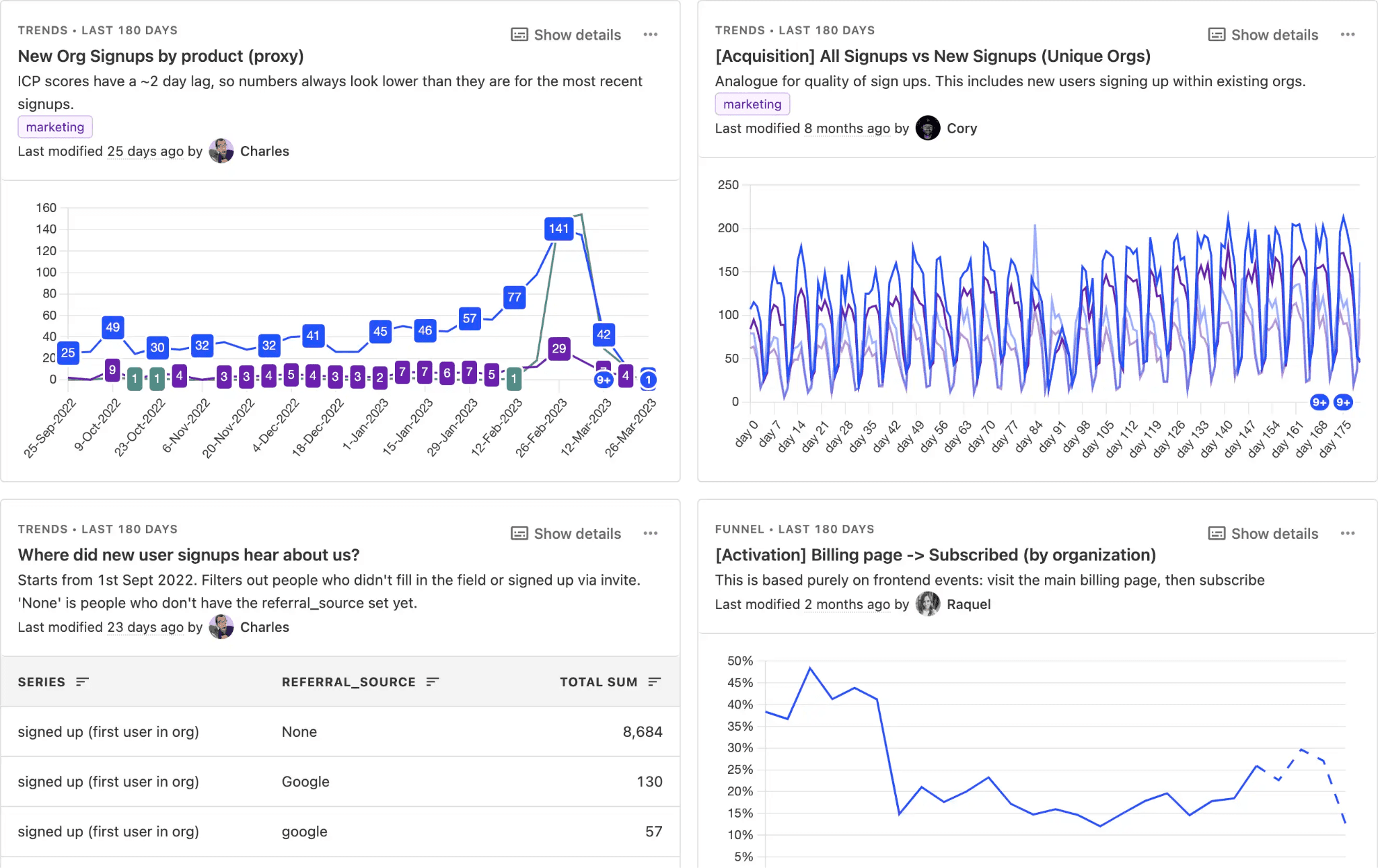
Dashboard examples from top product analytics products
Each of these tools has significantly more to offer than is shown in the examples screenshots below, but the images should give a basic level of insight into what a completed dashboard might look like. We recommend trying them out yourselves if you're curious to see what those functionalities are.
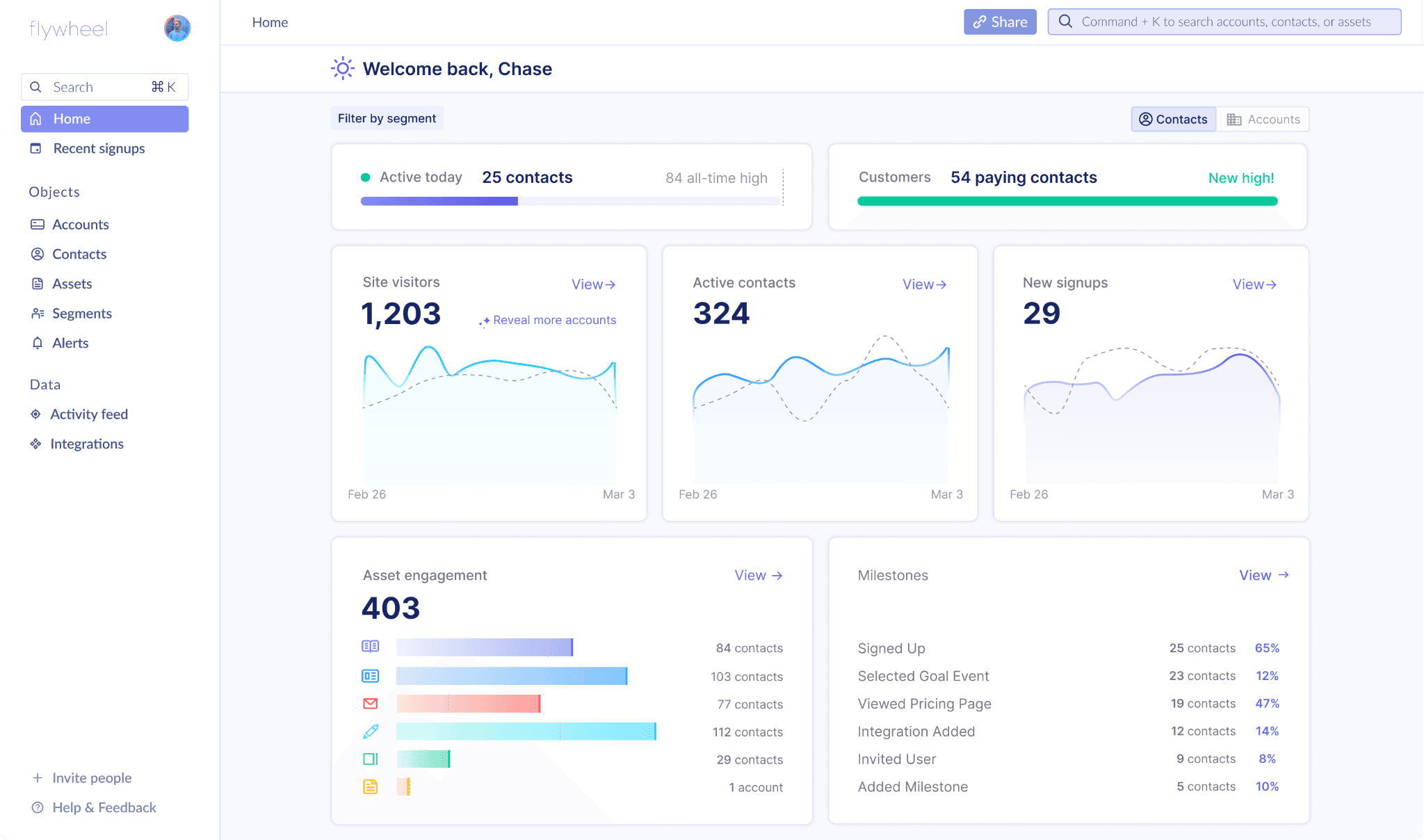
Flywheel
Simply connect a data source such as Segment, or install the Flywheel.js snippet, to instantly get these insights for your product and marketing channels. Flywheel takes a prescriptive approach to dashboards, choosing the best metrics and calculating them for you automatically. It also shows these statistics for both users and accounts out of the box.
Flywheel is best for: GTM executives, product teams, marketing teams, customer success teams, sales teams.
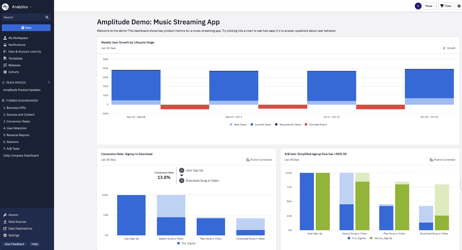
Amplitude
Amplitude helps companies build out analytics dashboards to the exact specifications that your team wants to create. This makes the tool very powerful, but also requires quite a bit of setup, data normalization, and critical thinking. If you're willing to invest the time needed, Amplitude can help you create dashboards for any metric.
Amplitude is best for: product managers, designers, engineers.
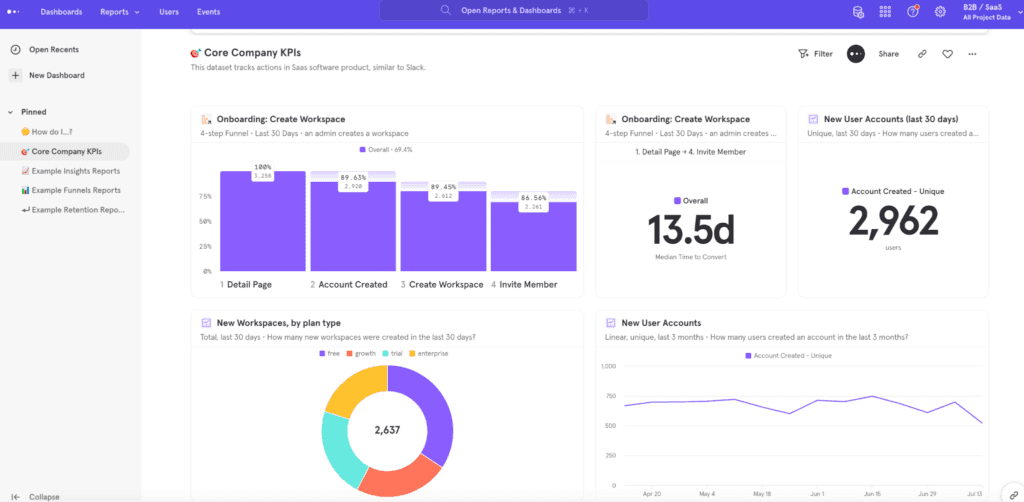
Mixpanel
Mixpanel has a friendlier UI than Amplitude, but they're functionally very similar. Specific "questions" can be answered by Mixpanel by creating queries and choosing the right visual format. They do offer a number of templates to help with this process, but understanding which events are important to track is still required.
Mixpanel is best for: product managers, designers, engineers.
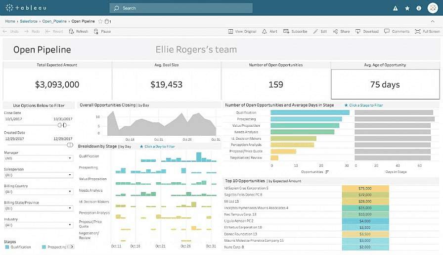
Tableau
Tableau, owned by Salesforce, is an extremely powerful analytics platform. However, it's best suited for large enterprises with dedicated data teams. Creating dashboards in Tableau is not nearly as easy or efficient as the other contenders on this list.
Tableau is best for: data analysts, data engineers, CXOs.
Posthog
Posthog is quite similar to Mixpanel in terms of adding dashboard templates to make setup easier. As a newer company, their analytics tooling is less capable and less configurable. However, after enough time is spent on honing your event names and conventions, Posthog can be effective for smaller companies.
Posthog is best for: engineers, product managers, designers.
Tips for optimizing your product analytics dashboard
Dashboards can be seen as living documents. They require constant attention to make sure they don't run into the issues called out at the beginning of this guide. To make the most of your product analytics dashboard over time, follow these tips:
Prioritize key metrics
Focus on the metrics that are most relevant to your business and provide actionable insights. Don't overwhelm your dashboard with unnecessary data.
Keep it simple
A cluttered dashboard can be difficult to navigate and interpret. Keep your dashboard clean and well-organized, using clear visualizations and minimal text.
Regular updates
As product usage data is constantly changing, it's important to keep your dashboard up-to-date. Regularly update your dashboard with the most recent data to ensure that you're making decisions based on accurate information.
Collaborate with your team
Your analytics dashboard should be a collaborative tool that multiple team members can use to monitor performance and make informed decisions. Encourage cross-functional collaboration and ensure that everyone has access to the data they need.
Use benchmarking data
Comparing your product performance against industry benchmarks can provide valuable insights into areas where you may be underperforming or excelling. Include benchmark data in your dashboard to help identify opportunities for improvement.
Continuously improve
Your product analytics dashboard is not a static tool. Continuously evaluate its effectiveness, make improvements, and iterate based on feedback from your team.
Fin
A product analytics dashboard is a powerful tool that can provide valuable insights into your product's performance, user behavior, and growth opportunities. By monitoring key metrics and visualizing data in an organized and easy-to-understand format, you can make informed decisions about your product roadmap and improve the user experience.
Whether you're a startup launching a new product or an established company looking to optimize an existing product, investing in a product analytics dashboard can bring significant benefits. By choosing the right tool, prioritizing key metrics, and collaborating with your team, you can drive the full potential of your product and unlock growth.
So, start implementing these practices and tools to boost your performance and stay ahead of the competition. The best advice to get started is to simply get started. Begin with the easiest products to set up, and move upwards in terms of complexity if they don't fit your use case. This will help you spend the least amount of time to get the best benefit.
Published on
May 8, 2023
Next up:
Table of contents